
Long Live the Glorious May 7 Directive
Books on Books No. 20
Published by Errata Editions
Text by Carol Yinghua Lu, Liu Ding, Shuxia Chen.
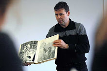
Featured image is reproduced from 'Long Live the Glorious May 7 Directive.'Long Live the Glorious May 7 Directive, published in 1971, is one of the key propaganda photobooks of Chairman Mao Zedong’s infamous Cultural Revolution. Illustrated with both color and black-and-white photographs taken by uncredited photographers, the book extolls the virtues of Mao’s communist ideology and purports to document the joyful, industrious effects of these ideas in action.
In Long Live the Glorious May 7 Directive, smiling workers and peasants read together from Mao’s “Little Red Book” of quotations, stalwart soldiers march in unending ranks and Chinese fighter pilots conquer the open skies. Of course, history remembers the realities of Mao’s Cultural Revolution quite differently.
Long Live the Glorious May 7 Directive is now extremely rare; Errata Editions’ Books on Books 20 presents this fascinating volume in its entirety with essays by Liu Ding, Carol Yinghua Lu and Shuxia Chen.
Featured image is reproduced from 'Long Live the Glorious May 7 Directive.'


WassinkLundgren - Ellen Thorbecke - Ed van der Elsken - Bertien van Manen - Reineke Otten in The Chinese Photobook Martin Parr Photography


Included in Parr & Badger, The Photobook: A History, Vol. I and Martin Parr and WassinkLunggren (eds.), The Chinese Photobook: From the 1900s to the Present. Often found incomplete and tattered, making this copy quite exceptional! In most copies, the photograph of Lin Bao, Mao's second in command, whose supposed 1971 coup attempt resulted in his death, are defaced. Shown at right, in this copy, it remains pristine.
"1966 was a momentous year in Chinese politics, for it marked the beginning of Mao Zedong's Cultural Revolution and the forming of the notorious Red Guards. Long Live the Bright Instruction celebrates five years of the Cultural Revolution, which Mao and his intimates initiated in an attempt to regain power after he had been demoted following the failure of his main policy initiative in the previous decade--the 'Great Leap Forward'. This is a true propaganda book in the sense that the bright colour photographs--most of them as carefully staged as an advertising shoot--totally mask the reality of the Cultural Revolution while extolling its virtues, exactly at the point when it was becoming discredited."--Parr & Badger
For a comprehensive look at Chinese propaganda imagery see Lars Hasvoll Bakke's brilliant survey on the subject at the excellent Crestock.com site


Mario García Joya: A la plaza con Fidel
Books on Books No. 21
Published by Errata Editions
Text by Leandro Villaro, Mario García Joya.
Featured image is reproduced from 'Mario García Joya: A la plaza con Fidel.'A la plaza con Fidel (To the plaza with Fidel) is doubly rare among Cuban photobooks: relatively few photobooks were produced in Cuba after the Revolution, and A la plaza con Fidel is also notable for its unique subject matter.
Photographed between 1959 and 1966 and published in 1970 by leading Cuban photographer and cinematographer “Mayito” (Mario García Joya, born 1938), the book focuses on Fidel Castro’s supporters and the festive atmosphere of the Revolution. Castro would mark important moments of the Revolution, when either revelry or reassurance was called for, with public addresses delivered in Havana’s Plaza de la Revolución; “to the plaza with Fidel” became a refrain of the Revolution.
The 21st volume in Errata Editions’ Books on Books series, this edition of A la plaza con Fidel presents this little-known book in its entirety, with essays by photography curator Leandro Villaro.
Featured image is reproduced from 'Mario García Joya: A la plaza con Fidel.'


Horacio Fernandez (ed.), The Latin American Photobook and in Parr & Badger, The Photobook: A History, Vol. II.
Mario García Joya ('Mayito') is without a doubt one the most influential photographers and cinematographers Cuba has produced. "This publication ... is at once a propaganda book and a masterly exposition of how to construct a photo-essay and photobook from (on the face of it)somewhat unpromising material."--Parr & Badger


Books on Photobooks
By: Steven Heller | June 13, 2016
It took a trip to Rome to find what is under my nose. In a lovely little bookshop, ONEROOM Books, Art & Photo—the title refers to it being one room and a small closet—is a wealth of excellent international photobooks and books on and about photobooks. The store is run by the amiable Stefano Ruffa, and has things not readily available in New York City, including an entire series by Manhattan-based Errata Editions. The under-my-nose-and-have-not-seen-it-in-New York–purchase included a reprint of Alexey Brodovitch’s most famous photographic book, Ballet.
By Joerg Colberg
Mar 4, 2011
The history of the photobook is filled with many absolutely amazing examples, many of which remain only known to experts - or those fortunate enough to have the means to acquire them. The main reason for this is mundane: It’s not because some elitists pick books and decide they are great. It’s because most of those books were printed once and then sold over the course of a few years. To make matters worse, there’s the Velvet-Underground effect: Many of those books didn’t even sell well, while inspiring what ultimately became a real movement. In fact, some books are so hard to get because they sold just a few copies, and the rest were then literally destroyed. The case of Alexey Brodovitch’s Ballet is particularly heart-wrenching: According to the main essay in this reprint, the original print run was five hundred copies, which were not sold through any major bookstores. In 1956, a fire at the artist’s farmhouse destroyed the majority of the negatives, along with most of his library, plus a collection of signed lithographs by Picasso and Matisse. There was another fire, in the next home, too. (more)
Alexey Brodovitch of course is widely known for his long work as an art director for Harper’s Bazaar from 1938 to 1958. But he also published a photobook entitled Ballet in 1945. The book, now available as part of Errata Editions, is nothing but astounding. With a background in ballet productions, Brodovitch had taken “souvenir” photographs between 1935 and 1937 of ballet companies visiting New York. The use of a 35mm Contax camera, available light, plus the relatively slow film at the time could have been considered a serious obstacle. But Brodovitch wanted to capture ballet the way he saw and felt it. And that included taking some of the often blurry and/or underexposed negatives and cropping small parts even further or messing with them in the darkroom. Only a few of those negatives - then on loan by someone else - survived the fires at his homes.
In the book, Brodovitch made the images transcend their sources. Presented full bleed, often heavily manipulated (in addition to cropping there are various other things he did), the photographs were transformed into the most amazing experience, an expression of ballet itself. The images jump and move and dance in ways that must have been revolutionary in 1945 and that still are (or maybe I should say are again) revolutionary today. Photobooks these days often are made by photographers, with maybe a little bit of input by a designer. Ballet, in contrast, clearly was made by a visual artist who knew everything about design, and who wasn’t so concerned about the sacredness of a photograph. If it needed to be cropped, then it was cropped. If the grain needed to be brought out even more, that it was brought out. If the spread required a photo to be flipped, it was flipped. Brodovitch was after the effect, and the result is stunningly successful (and I don’t even care about ballet!).
The success of the book is based on the fact that everything was done for a purpose, with a clear intent in mind. Each of the design or photography related decisions was made so that the final result would work best. That is, of course, how you want to produce a photobook, and Ballet might just be a perfect example of photobook making that is, well, simply timeless.


BALLET [104 Photographs by Alexey Brodovitch]
Alexey Brodovitch
Alexey Brodovitch: BALLET [104 Photographs by Alexey Brodovitch]. New York: J. J. Augustin, 1945. First edition [limited to 500 copies, though allegedly far fewer were produced, most were distributed as gifts]. Oblong quarto. Plain boards with cloth spine. Fitted and attached printed dust jacket [as issued]. Publishers slipcase. 144 pp. 104 gravure reproductions. 12 elaborate typographic segment dividers. Text by Edwin Denby. Penciled gift inscription on front free endpaper. One-eighth-inch nick to the lower edge of page 125/6 with no loss. Form-fitted jacket worn and splitting along front bottom edge. Spine heel and crown lightly split and chipped. Front corners rubbed, and rear panel lightly marked from handling. The uncoated jacket was designed to add strength to the fragile book construction by completely covering the boards and was pasted onto itself at the outer flaps. The previously unknown Publishers slipcase is cardboard covered with a wood-patterned paper veneer with tipped-on printed panels to front and spine mirroring Brodovitch's elegant Title typography. The faux-wood slipcase recalls the sidestage fringes where Brodovitch photographed the dancers. One edge splitting with a vintage tape repair and expected wear overall. A very good copy housed in a fair to good example of a previously unrecorded slipcase.
BALLET is the rare title sanctified by unanimous inclusion in the holy trinity of PhotoBook Agenda Setters: THE BOOK OF 101 BOOKS [Roth et al], THE OPEN BOOK [Hasselblad Center], and THE PHOTOBOOK: A HISTORY Volume 1 [Parr & Badger].
"The picture represents the feelings and point of view of the intelligence behind the camera. This disease of our age is boredom and a good photographer must combat it. The way to do this is by invention -- by surprise. When I say a good picture has surprise value I mean that it stimulates my thinking and intrigues me. The best way to achieve surprise quality is by avoiding cliches. Imitation is the greatest danger of the young photographer.
--Alexey Brodovitch, 1964
--Alexey Brodovitch, 1964
11.25 x 8.75 book with 144 pages, 104 full-page gravure plates and 11 elaborate typographic segment dividers: Les Noces, Les Cent Baisers, Symphonie Fantastique, Le Tricorne, Boutique Fantasque, Cotillion, Choreartum, Septieme Symphonie, Le Lac des Cygnes, Les Sylphides and Concurrence. Brodovitch photographed several of the leading Russian ballet companies whilst they were in New York on their world tours between 1935 and 1937. The contents are divided into eleven segments, one for each ballet performance. On the contents page, Brodovitch introduces each chapter in a typographic style that emulates the feel of the dance it is describing.
"When you first glance at them, Alexey Brodovitch's photographs look strangely unconventional. Brodovitch, who knows as well as any of us the standardized Fifth Ave kind of flawless prints, offers us, as his own, some that are blurred, distorted, too black and spectral, or too light and faded looking, and he has even intensified these qualities in souvenirs, and he first took them to have a souvenir of ballet to keep. From the wings, from standing room, watching the performance, absorbed by a sentiment it awakened, he snapped, one may imagine, almost at random. But as you look at his results you come to see that he was steadily after a very interesting and novel subject. He was trying to catch the elusive stage atmosphere that only ballet has, as the dancers in action created it."
--Edwin Denby
--Edwin Denby
"Brodovitch's signature use of white space, his innovation of Bazaar's iconic Didot logo, and the cinematic quality that his obsessive cropping brought to layouts (not even the work of Man Ray and Henri Cartier-Bresson was safe from his busy scissors) compelled Truman Capote to write, "What Dom Perignon was to champagne . . . so [Brodovitch] has been to . . . photographic design and editorial layout."
-- Jenna Gabrial Gallagher, Harper's Bazaar, 2007
-- Jenna Gabrial Gallagher, Harper's Bazaar, 2007
"The legendary Brodovitch dominated New York fashion and photography during the 1940s and 50s from his powerful position as art director and graphic designer for Harper's Bazaar and through his influential workshop courses at the Design Laboratory, where he taught aspects of photography and graphic design. Among his now-famous followers were Richard Avedon, Lisette Model and Garry Winogrand. In his teaching, his magazine layouts and his photography he reveled in breaking all of the rules that had controlled the more static American photographic scene of the pre-War era. Ballet has been described as 'The first photobook to prefigure or set out a photographic approach to this [US post-War stream-of-consciousness] artistic and cultural upheaval'. In it, Brodovitch reproduced a series of photographs he had made of visiting Ballets Russes companies' performances in New York during the period 1935 - 37. . .
" . . . Using a 35mm camera without flash he had worked with, rather than against, the inevitable blurred and grainy results to create photographs that are full of drama and life. This dynamic is maintained throughout the pages of the book, where the full bleed images run on from one to another in a filmic continuum. 'Ballet has become a photobook legend for two reasons. Firstly, only a few hundred copies were printed, so the book is more talked about than actually seen. Secondly, the volume was extremely radical, both in terms of the images themselves and their incorporation into the design and layout."
-- Parr & Badger, THE PHOTOBOOK Volume I, pp. 235 & 240.
-- Parr & Badger, THE PHOTOBOOK Volume I, pp. 235 & 240.
Books on Photobooks
By: Steven Heller | June 13, 2016
These are well-designed series of reprints but not facsimiles, which makes them interesting documents but not reproductions of the original. They even state, “The Errata Editions Books on Books series is an ongoing publishing project dedicated to making rare and out-of-print photography books accessible to students and photobook enthusiasts. These are not reprints nor facsimiles but comprehensive studies of rare books.”
Still, books like Ballet are so rare that it is important to have them in any well-produced format. And another book that is worth having is Laszlo Moholy-Nagy’s 60 Fotos—while not a rarity it is nonetheless a treat to have in this form.
By Joerg Colberg
Mar 11, 2011
Here we are, in 2011, and most of the photography in 60 Fotos by László Moholy-Nagy will strike us as incredibly old-fashioned and/or dated. Over the course of the 80 years since the book’s original publication, photography has evolved a lot (our thinking about it a bit less so, of course). But there is something, actually a lot to be gained from going back to the book and from looking at photography with the eyes of and guided by this well-known Bauhaus artist. (more)
Of course, this is where personal bias enters, something which I cannot - and will not try to - escape (Art criticism without personal bias is not criticism, it’s merely a description. Art without opinions is not art, it’s entertainment). Two things have always fascinated me about the way Bauhaus artists approached photography. First, there was an unwavering willingness to explore the medium’s possibilities. Second, photographers worked hand-in-hand with other artists, such as designers. We might have a lot of new photographic opportunities right now, but are photographers as willing to embrace what the medium has to offer as their Bauhaus progenitors? I don’t think they are.
We might smile about many of the very basic photographs, exploring depth of field or whatever else - but the photomontages look dated and fresh at the same time. Experimentation in this day and age often just means to see how large an image can be printed or how to smartly sharpen an image. And ironically, while very old photographic techniques are being celebrated, artists pushing the boundaries have to deal with questions like “Is this photography?” It’s not hard to imagine how Moholy-Nagy would have reacted to that question. Just look at the images in 60 Fotos to see whether or not he was willing to be restricted by criteria what photography might be.
The book is a manifesto, showing what photography can do when you’re willing to take it anywhere it might go. It is fearless. Maybe we need a little bit more fearlessness in contemporary photography.


But these are not simply excerpts or thumbnails. “Each in this series presents the entire content, page for page, of an original master bookwork which, up until now, has been too rare or prohibitively expensive for most to experience. Through a mix of classic and contemporary titles, this series spans the breadth of photographic practice as it has appeared on the printed page, enabling further study into the creation and meanings of these great works of art,” states the website.
The true breadth of each book is shown with “illustrations of every page in the original photobook being featured; contemporary essays by established writers on photography, composed specially for this series; production notes about the production of the original edition; biography and bibliography information about each artist.”


Geen opmerkingen:
Een reactie posten