
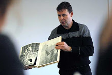
The Dutch graphic designer and artist Jan Bons turns 90 this April and to celebrate this milestone the designer Lex Reitsma has made an 50 min. long documentary film about his life and work, and for the Kunsthal Rotterdam (NL) Lex has organized an exhibition showing 90 of Jan Bons’ posters.
Although multi-talented it is the graphic design work of Jan Bons for which he is most recognized. He has designed postage stamps, books, brochures, program booklets and many posters all of which bear a strong, self-assured, and non-conformist style.
Sandberg was an inspiration for Bons and this is evident in his use of torn paper, self-styled typography and the use of primary colours; it was Sandberg who suggested to Bons that he always use red somewhere in a poster design. Jan Bons’ posters are the work of a painter turned typographer; they are free, bold and very direct using a minimum of resources. Large, often hand written letters take the place of images and he never uses distracting decorations.
Throughout his career he has remained faithful to a small number of clients including the theatre groups Studio and De Appel, the ship owner Van Ommeren, the International Documentary Festival (IDFA) and the music group Nieuw Ensemble. For all of these he has made an extensive body of work and in several cases it became an integral part of their identity. His work for De Appel spans the period 1972 to 1996 and with it’s almost solely typographic presentation it became synonymous with the groups name. Bons is quoted as saying: “I have always been of the opinion that a theatre group must be visually recognizable in one form of publicity, be it posters, program booklets or advertising. A poster must therefore reflect the continuity of the company.
”The film ‘Jan Bons – a designer’s freedom’ is available as a DVD with English sub-titles and packaged with a small book in Dutch and English written by Paul Hefting; it accompanies the exposition of 90 posters in the Kunsthal Rotterdam from March 8th to the 12th of May 2008.
 "Jan Bons - Ontwerpen in vrijheid" is een film van Lex Reitsma over leven en werk van de grafisch ontwerper Jan Bons. Het is een intiem portret van een bijzondere man en een groot kunstenaar. Lex volgde de bijna negentigjarig tijdens het maken van affiches voor het 25-jarig jubileum van het Nieuw Ensemble en voor het IDFA. Bons vertelt over zijn manier van werken, zijn vriendschap en samenwerking met Rietveld en Sandberg en over zijn rol in de oorlog. Daarnaast komen opdrachtgever Erik Vos, ontwerper en afficheverzamelaar Gielijn Escher en Bons' zonen Joël en Jeroen aan het woord. Lees meer ...
 50 jaar Bruynzeel 1897-1947. [Text M. Redeke [Maurits Dekker] (firm's history). Photography Carel Blazer, Eva Besnyö. Illustrations, Layout: Jan Bons, Jaap Penraat]. Zaandam / 1947 / 130 p. / hb. / 33x26cm / 154 b&w photographs, in opdracht en uit bedrijfsarchief / bedrijfsreportage, documentaire foto's / productieproces, ontspanning, opleiding). - Ill. 20 color / schematische ontwerptekeningen en komische pentekeningen. / NN / Firmenschrift / Wirtschaft, Firmengeschichte - Photographie - Anthologie - Auftragsphotographie, commissioned photography - Nederland, Niederlande - 20. Jahrh. / Printed by Firma L. van Leer en Co, Amsterdam (offset). - Opdrachtgever: C. Bruynzeel & Zonen (50-jarig bestaan). - Voorloper van bedrijfsfotoboek met kenmerken van beeldverhaal. De indeling van het boek is thematisch, naar type eindproduct. In het laatste hoofdstuk is aandacht voor de sociaal-maatschappelijke kant van het bedrijf. De fabriek wordt metaforisch voorgesteld als een levend organisme.
 De jong & van dam nv. [Text Jan Bons (firm's history). Photography Ed van der Elsken. Layout Jan Bons]. Hilversum / 1962 / 28 p. / paperback / 35x26cm / 31 b&w photographs / bedrijfsreportage en geënsceneerde foto's / productieproces en modebeelden). / NN / Firmenschrift, Festschrift / Firmegeschichte - Photographie - Anthologie - Auftragsphotographie, commissioned photography - Nederland, Niederlande - 20. Jahrh. / Printed by Steendrukkerij de Jong & Co, Hilversum (offset). - Opdrachtgever: De Jong & Van Dam NV (50-jarig bestaan). - Filmisch scenario. De tekst is gezet uit de Gill. de jong & van dam is wat betreft opmaak, formaat en typografie verwant aan het eigentijdse tijdschrift Twen.
De verbinding. [Text Jan Elburg (essay). Photography Violette Cornelius, Eddy Posthuma de Boer, Paul Huf, Hein de Bouter. Layout: Jurriaan Schrofer. Illustrations: Jan Bons]. Den Haag / s. a. [1962] / 76 p. / pb. (sewn) / 24x20cm / 39 b&w photographs, 10 color, in opdracht en afkomstig uit het bedrijfsarchief en uit archieven van fotografen / documentaire -, geënsceneerde - en productfoto's / 'De verbinding' tussen mensen. - Ill. 9, b&w photographs / telefoondoodels, atoommopjes en striptekeningen). / NN / Firmenschrift / Photographie - Anthologie - Auftragsphotographie, commissioned photography - Nederland, Niederlande - 20. Jahrh. / Printed by Steendrukkerij de Jong & Co, Hilversum (offset). - Opdrachtgever: Staatsbedrijf der PTT (ingebruikneming). - Filmisch scenario. De tekst is gezet uit de Courier. Evenals de jong & van dam (1962) is De verbinding informeel van karakter. Beide zijn gedrukt in punt-op-punt-vernis. J. Schrofer werd voor de samenstelling ervan benaderd na contact met P. Brattinga. S. den Hartog had de leiding over de productie. Portretten van de samenstellers staan op het voorplat. Er bestaat een Engelstalige editie onder de titel The Connection. De uitgave bevat 10 uitslaande pagina's.


Geen opmerkingen:
Een reactie posten